11. What is a Candlestick Chart?
A candlestick chart is one of the most widely used tools in technical analysis. It visually represents a stock’s Open, High, Low, and Close (OHLC) prices for a specific time period (like 5 minutes, 1 hour, 1 day, etc.) — all shown in a candle-shaped graphic.
> “Each candlestick tells a story about price behaviour, market psychology, and trader sentiment — all in a single candle.”
Structure of a Candlestick
Each candle consists of two parts:
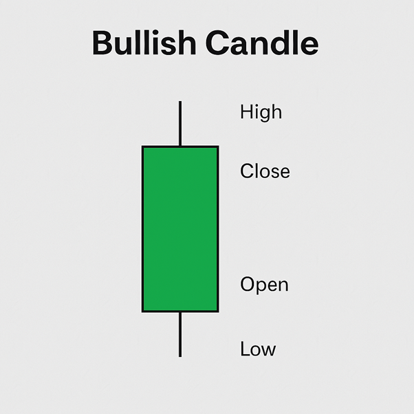
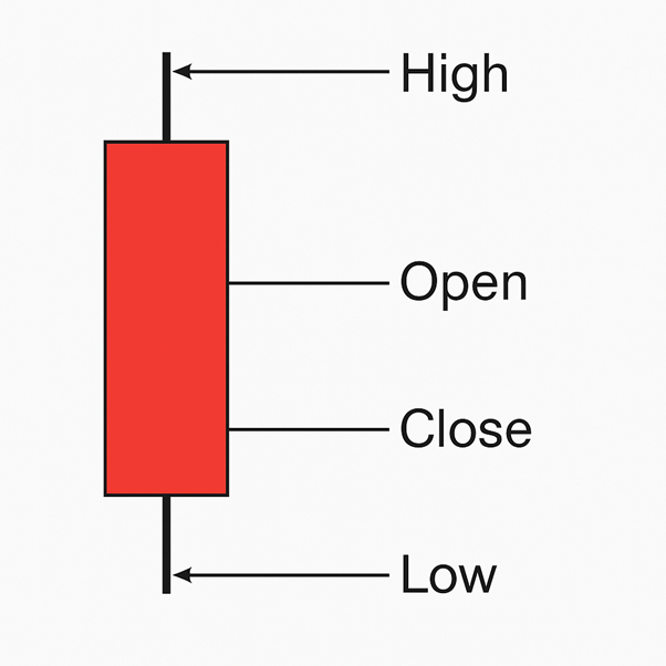
- The Body (Rectangle)
- Represents the range between Open and Close prices
- Green/White Candle: Close > Open (Bullish)
- Red/Black Candle: Close < Open (Bearish)
- The Wicks or Shadows (Thin Lines Above & Below)
- Upper wick = highest price
- Lower wick = lowest price
Visual Layout of a Candlestick
Bullish Candle (Price Closed Higher)
Bearish Candle (Price Closed Lower)
Timeframes for Each Candle
- Each candlestick represents one unit of time:
- Daily chart → 1 candle = 1 day
- 5-minute chart → 1 candle = 5 minutes
- Weekly chart → 1 candle = 1 week
Why Candlestick Charts Are Popular
| Feature | Benefit |
|---|---|
| Combines 4 data points | Open, High, Low, Close in one candle |
| Easy to read | Quickly shows who is in control (buyers or sellers) |
| Reveals patterns | Can form reversal or continuation signals |
| Visually appealing | More intuitive than line or bar charts |
| Works across assets/timeframes | Used in stocks, forex, crypto, intraday & long-term charts |
Candlestick vs Line Chart
| Line Chart | Candlestick Chart |
|---|---|
| Only shows closing prices | Shows open, high, low, and close prices |
| Simpler view | More detailed and informative |
| Good for beginners | Better for short-term traders and analysts |
What Can You Learn from a Candle?
- Big green candle + high volume = Strong bullish momentum
- Small body + long wicks = Indecision (Doji-type candles)
- Long red candle after uptrend = Possible bearish reversal
- No wicks = Strong control by buyers/sellers in that timeframe
Common Single-Candle Signals
| Candle Pattern | Meaning |
|---|---|
| Hammer | Bullish reversal signal |
| Shooting Star | Bearish reversal signal |
| Doji | Indecision / potential reversal |
| Marubozu | Strong bullish/bearish momentum |
> These patterns become more meaningful at key support/resistance zones or after trends.
Key Takeaways
- A candlestick chart displays OHLC prices in a visual format.
- Candles can be bullish or bearish, depending on whether the price closed higher or lower.
- Wicks show extremes, while the body shows strength.
- Traders use candlestick charts to spot patterns, reversals, and trend continuation.
- Every candle gives valuable insight into price action and trader psychology.